Solid colours photograph better than busy patterns
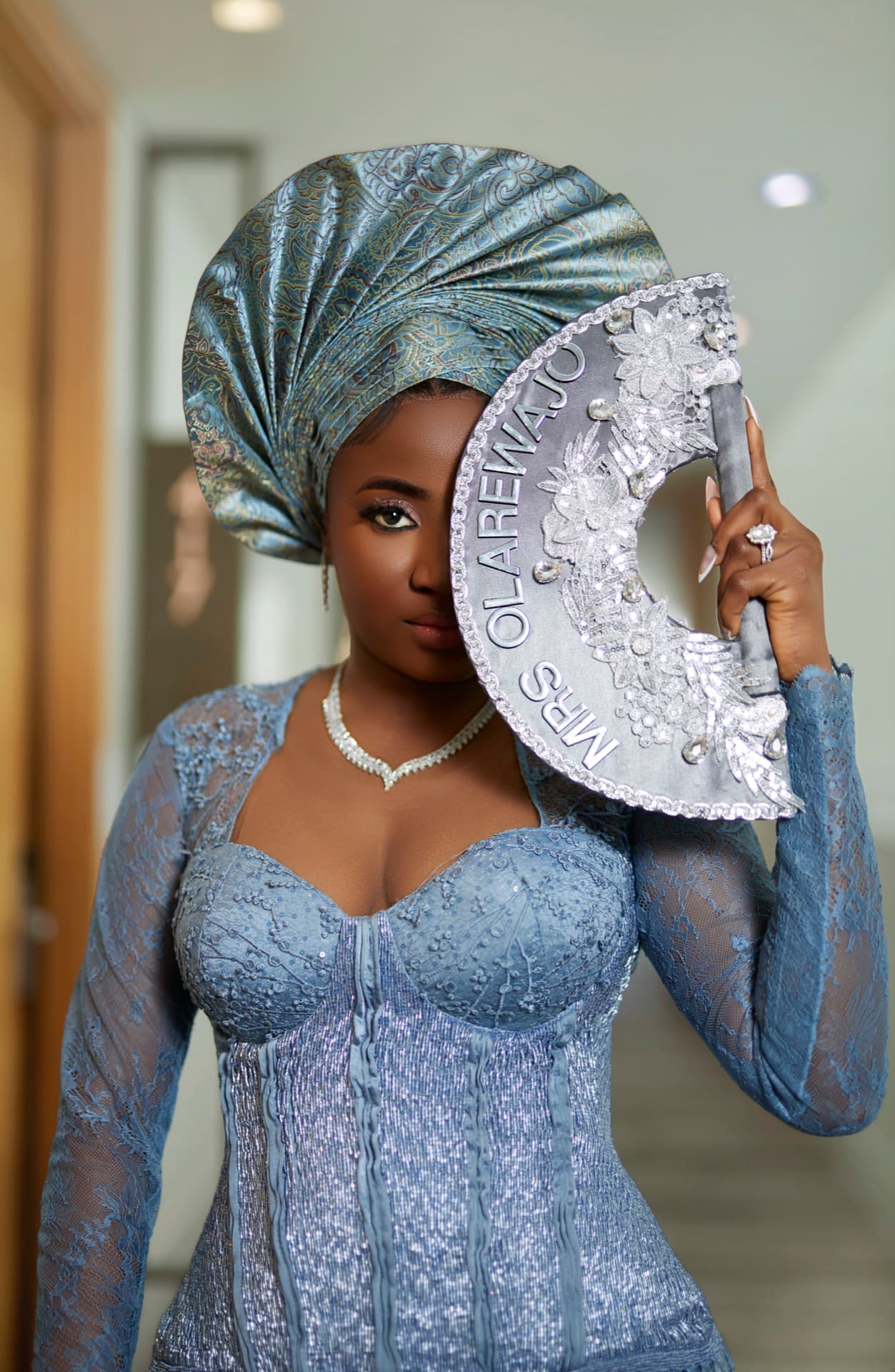
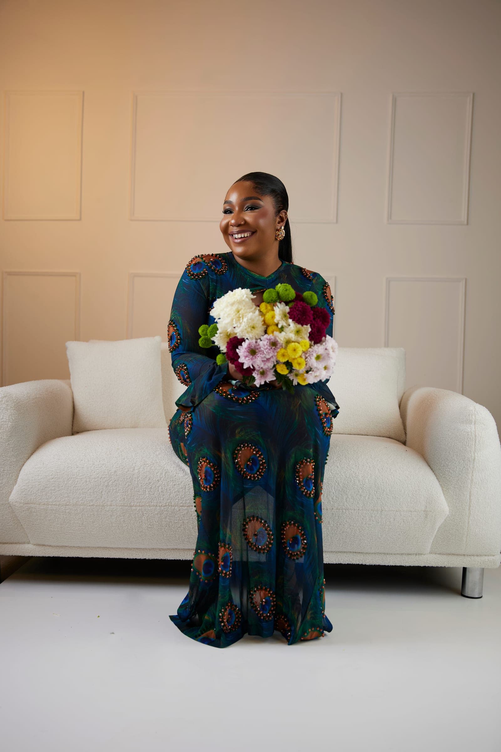
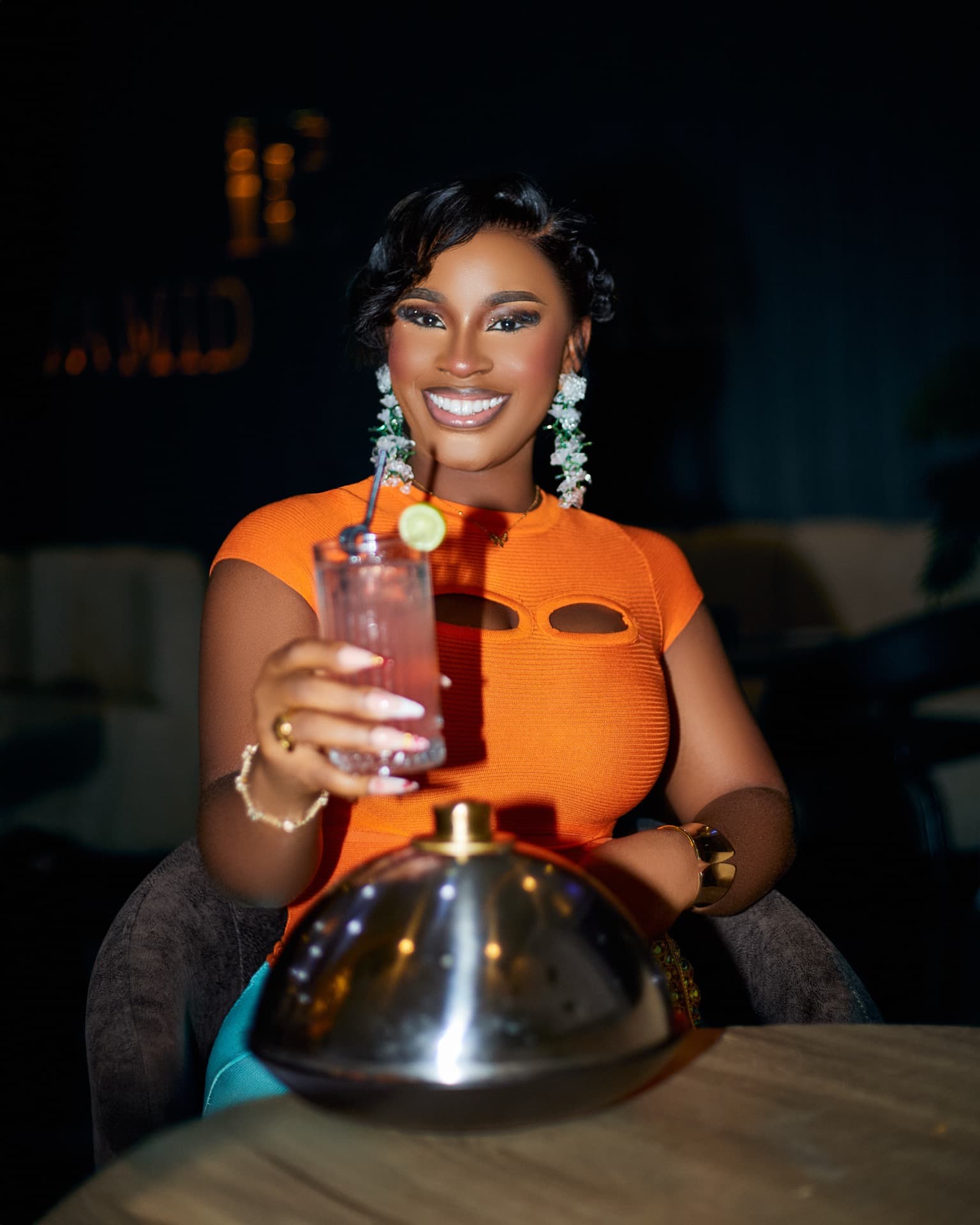
This comes up in almost every single consultation, and I get why — it feels like the one thing you actually control before the day. Here's the honest version: small patterns, logos, big text on a t-shirt, all of it pulls the eye away from your face, which is sort of the opposite of what a portrait is meant to do. Solid colours, or something with just a bit of texture, hold up so much better in photos. They age better too — you won't look back in five years and immediately clock what year it was from the t-shirt.
Coordinate, don't match
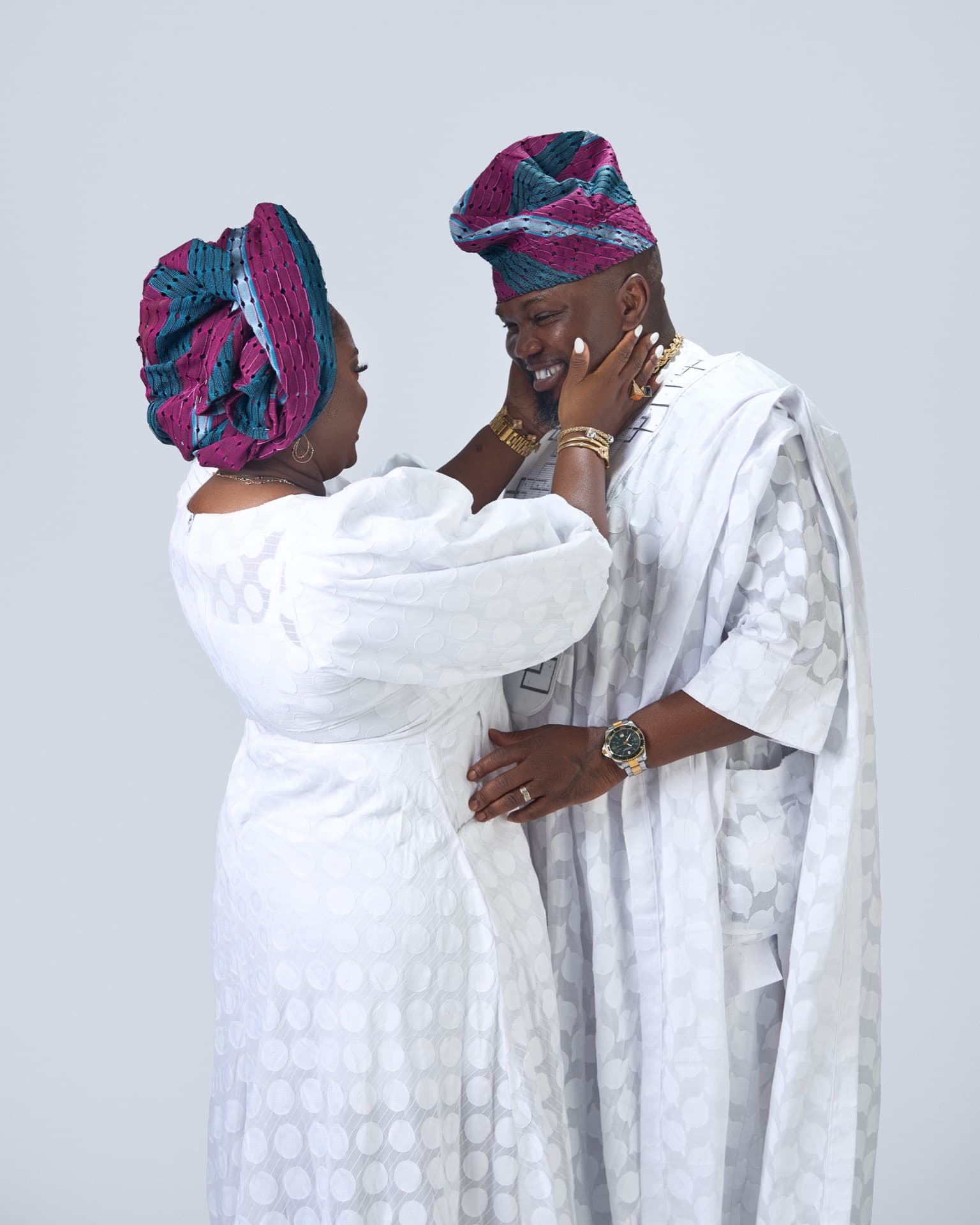
Please don't put everyone in identical white shirts and jeans. I understand the instinct — it feels "safe" — but it reads as staged the second you look at the photo. What actually works is picking a small palette, two or three colours, mostly neutrals plus maybe one accent, and letting everyone wear their own version of it. It holds together without looking like a uniform.
Think about the location
Your outfit and your backdrop are having a conversation whether you plan it or not, so you might as well plan it. Warm, earthy tones sit beautifully against Cardiff Bay or the Transporter Bridge in Newport. Something lighter and breezier works better against Swansea's coastline. If we've already picked a spot, message me — I'd rather help you think it through than have you guess.
Bring options, especially for maternity and events
For maternity sessions, fitted beats loose almost every time — you want the shape of the bump to actually read in the photo, not disappear into fabric. For events and graduations, if you can manage it, bring a backup outfit. Light changes more than people expect over the course of a day, and having a second option in the car has saved more than one session for me.
Related Pages